Monday, 19 October 2015

film noir mark epton

http://www.pxleyes.com/photography-contest/20711/film-noir-2.html


https://www.flickr.com/photos/morgana_nagorski/8365567456


\


http://mag.splashnology.com/article/showcase-of-film-noir-photography/7917/


http://1aled.fotomaps.ru/photo-film.php


http://www.deviantart.com/morelikethis/collections/26319867?view_mode=2


http://chloroformperfum.deviantart.com/art/Film-noir-4-81331683


https://www.pinterest.com/aniaskupPSC/theme-assembled-still-life/


https://www.flickr.com/photos/jonathancohen/4492055831


martin parr- mark epton

  1. What time period do you think the photograph was taken? Give reasons for your answer.1975-80 because its old fashioned
  2. What do you think was the genre/subject? Butlins photo-story/documentary
  3. Are the elements in the shot balanced? yes
  4. What message could the photograph be trying to convey? Trying to get you to go there got have fun
  5. Do you notice anything striking about the shot? The bright colours because they are over saturated.
  6. Do you think consent was needed from the subjects? Yes I think permission would be needed as there is kids in the pool
  7. What is the viewpoint? Wide shot
  8. If you were to produce this shot what would you do differently? I would do it as a birds eye view.

Tuesday, 13 October 2015

photography eveluation

Mark Epton
Photography evaluation


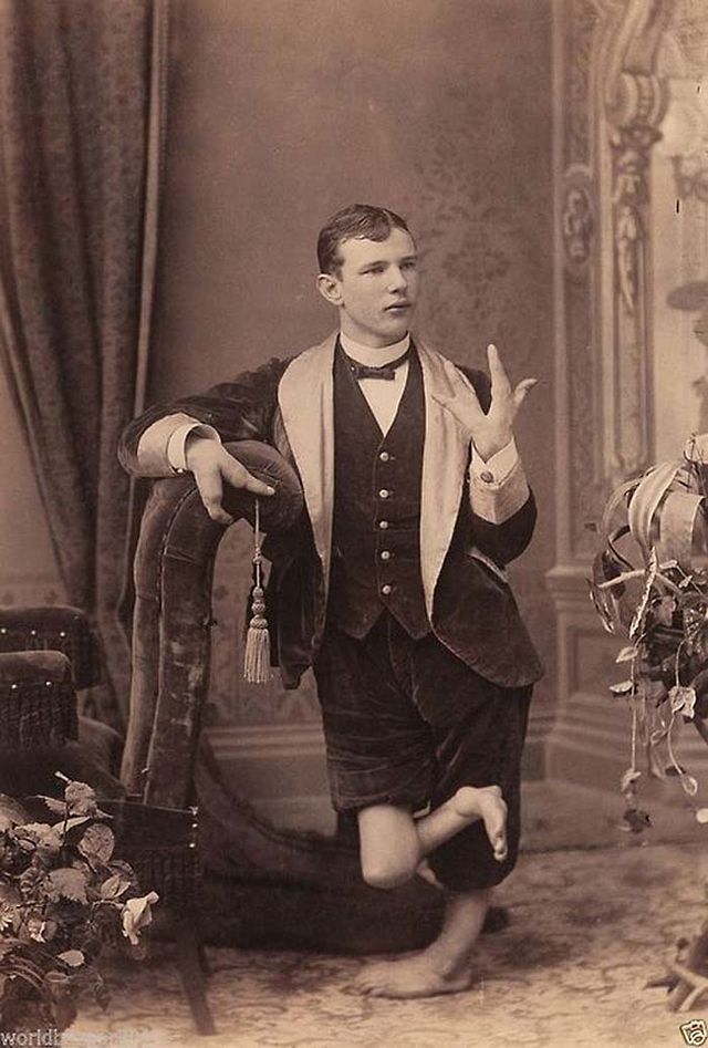
In photography lesson we had to create a freaky image using objects we find that are unusual. I researched freaky pictures to find something for inspiration and I found a lot of pictures that were freaky but they were from the Victorian times and they were of people that were in freak shows. For a freaky image you have to have something that is unusual or freaky or something that just isn’t right. The freaky images I found weren’t just freaky because of the things the people were doing or looked like they were also freaky because they were black and white. The cameras that were used in the Victorian times were called bellows camera and you had to sit in front of them for up to half an hour, so for the pictures from my research you would have to sit very still or the picture would be blurred. I also did some research on the bellows camera, and I found out that the photographer would move the backwards and forwards to focus the camera and they would then add a glass plate with chemicals on to take the picture. My idea was to have some freaky objects that stand out to people and create a final piece using those images I wanted my final piece to look as freaky as possible but with the blue background it didn’t work. The location I used to take the photos was the room next door because it was empty and there was room to set up the lighting and tripod. The props that were used were unusual but not that unusual. I could have made them weirder using the tools in Photoshop but I didn't because I wanted to leave them how they was. To editing my final photographs I used the curves tool in Photoshop to make the pictures lighter and darker and the pen tool to merge the pictures together to make a collage of photographs. For my final task I made an advert that was advertising a film.

If I could do the project again I would make the photos look more weird using the tools on Photoshop, I’ve learned to not waste time with the lighting and get the photo's done in a short amount of time so  I can get them edited to get my final piece done and make it look better than it does. I don't think the my final piece matches the proposal because I did something different and I don't think it meets the assignment brief because the brief asked for a freaky image but my image want freaky enough to meet he brief. If I was to do the vase again I would have made the opacity lower to make the glass see through and I would make it a bit lighter and I would add I little shine using the paint tool. 

advert evaluation

Owain Davies 
Advert evaluation

I used Photoshop to produce a magazine cover for my product which is called Avidity. To create my final piece I had to use the quick selection tool to cut out my product and then use the rotate tool to make it diagonal from the writing. I used green and red because they are the colours that stand out the most on magazine covers. I researched magazine covers to see what the layout was like and what the size was for the cover, I looked at the sizes of the fonts and looked at the location of the fonts on the cover. Researching other magazine covers gave me some ideas to help me with my magazine cover and I also found a magazine that my product would go well with. I didn’t learn any other skills because I use Photoshop often I have used all of the tools and know how to work it. My final piece could have been better because it looks rushed and it doesn’t look very creative. If I was to do it again I would use fonts off of Dafont to make my magazine cover stand out more. I would still use the same colours as they stand out and look good together.  I’m not happy with my final piece because I spent more time on my planning then actually creating my final piece.

My product photo was taken on Lumix camera and transferred it onto my hard drive. To cut out my product I used the quick selection tool and cut it out using the inverse button which you can find if you hover over the select tab. I kept the original background layer on photo shop so I could easily put a black background in. once id cut out my product I hid it so it wasn’t in my way when I was adding the magazine name and the tagline. I was going to use Dafont for my writing but I didn’t have enough time to find a font that would match my advert.

Tuesday, 6 October 2015

location recce

Faye Jackson

Advert

 For our location we are using the car park next to NCN but, the lift is out of order so we are cutting the lift part out.
 Reece and Jake will have to be careful running up the stairs because they could be wet and slippy.
The public use this car park but we will stop filming if somebody is walking past and if the are filmed before we get a chance to pause they will be cut out during editing.


Reece is going to be doing a point of view shot so we can get a little more emotion for the advert.


Monday, 5 October 2015

levels and curves in photoshop

Mark Epton

i am using levels to make the image lighter and darker. the image will look better if i get the right balance of dark and light.if i used curves it would be easier to use then levels because its easier to line up the curves and make it lighter and darker.
this is an example of a picture made lighter by using curves. it was easy to do because i have used curves before so its easier for me to use then level because i find it simpler and better because you get a clear picture.


Thursday, 1 October 2015

avidity label owain

Owain Davies
Avidity


I have selected these fonts because the stood out and fit with the mild horror theme we have chosen. I used the snipping tool to get them off the the website and get them onto Photoshop. I used the quick selection tool to cut out the background and Ican now add color or use liquefy to make it different shapes.


To add the colour I used the quick selection tool and because the colour was set to grey scale I went to image, mode and selected RGB colour. I chose my colour and started to colour in the letters. I used a blood red colour because of the horror theme we have selected.
I particularly like the like the bloody font because its like a horror text and it stands out from all the rest.


the group decided to use green as our brand product and I suggested black and green for the font so I went into Photoshop and use the quick selection tool and did the green and black.

Tuesday, 29 September 2015

advert ideas

Faye Jackson
my group

Jake is confident and likes acting so he will be the zombie.
Reece is also confident and he is being the guy that eats the avidity bar.


Advert Ideas

our advert idea is that Reece is on his way to work and he sees a zombie who is played by Jake. Reece eats the Avidity bar and runs really fast up stairs and gets away from the zombie.
we choose Avidity for the name of our product because its another word for energy and its sounds better than energy bar.


freaky adverts

Faye Jackson


freaky advert
the first advert we found that was freaky was the one that is banned off of the TV and its a McDonald advert.the advert is freaky because the clown is a little scary and the clowns makeup is flaky so it looks like the clowns face could just shatter like glass. https://www.youtube.com/watch?v=a8g5FVkzgc4

the second advert was little baby's ice cream and that was freaky because there is a man covered in ice cream off of himself and its disgusting but fascinating at the same time. https://www.youtube.com/watch?v=erh2ngRZxs0

the third advert is a phone's 4 U advert and its the little girl advert its weird because she doesn't even look real at first and then when she gets a bit closer she is and then she pops up at the end. https://www.youtube.com/watch?v=N2oL_gXECtg

Monday, 28 September 2015

basic camera techniques

Mark Epton
basic camera stuff

Q1:
- rule of thirds
-cropping
-birds eye view
-leading lines

Q2:
hold the shutter down half way and then slowly press down the shutter button.

Q3:
-aperture
-speed
-program
-manual 


Aperture controls the blur in the background.

taking and editing pictures
using the cameras i took pictures of objects and put them into photo shop and used curves to make it lighter or darker.
this is a vase that i took a picture of. i use the level tool to make it a little bit lighter and the crop tool so it was A4 . to focus the camera i pushed the capture button in half way and then i gently fully pressed it. the camera was in the program setting so it choose the shutter speed and aperture for me.
the was the right level of light and dark so all i did was use the quick selection tool, inversed it and the pressed back space so it took out the background. i the pressed control and T and spun it round so it was slanted and saved it as a JPG.
Thursday, 24 September 2015

simple banner

Owain Davies
simple banner and poster
i first started to make my banner on photo shop using the rectangle tool and the anchor point tool. with the anchor point tool i put a paint on the left and right side held down shift and cut a semi circle out of the rectangle on each side. after that i went back onto the rectangle tool and held down shift to make a square to make the square into 2 equal triangles you have to use the direct selection tool on the right bottom point of the square then press back space to make it a triangle.
i copied and pasted the triangle and flipped it so it was equal to the other one. that is how i made the banner.
To make the background i just merged the banner together and then i hid it so i wouldn't get confused or ruin it. i added another layer to start making the background, i started off with a black background and double clicked the background layer to make it a gradient color. the background is now multi colored. i then added my harry gremlin to another layer and made sure he look alright against the background and i then shown the banner and saved the image.
i added a little bit of writing to the bottom of my poster saying 'or Unique' and i edited the writing to emboss it by double clicking on the writing layer i added an overlay color and under glow to make the writing stand out more.
if anyone needed help with making this i could help.

ghostly image- owain

Owain Davies 

Creating a ghostly image

for this ghost image i found a photo of an angry doctor and added it to the background i found before i started the work. i had to cut out the doctor so it would get rid of the white background and then i made him black and white and i put the opacity level to 48% to make him look more ghostly i also added a blur to him. for the blur i used Gaussian blur.
i did the same for all of the other images but for the 2nd ghost image the opacity is down to 11% so it looks like a shadow of a ghost.
for the 3rd the opacity is 46%. 
 this image is a baby because the background is a nursery of an asylum.


this image is a woman sat in the corner of the room because at the asylum pictures i looked at the people in there all sat with the knees to their head.

Wednesday, 23 September 2015

wasp Marissa

Marissa Johnson 

wasp (short film) by Andrea Arnold

shots: 
  • close up
  • extreme close up
  • mid shot
  • wide shot
  • establishing shot 
  • medium close up


diagetic sounds:
  • foot steps
  • knocking on door
  • cars driving past
non diagetic sounds:
  • baby crying
  • birds tweeting
  • music 
Panasonic HDC 900
  • superior movie quality
  • digital camera mode
  • touchscreen LCD
  • range of manual and advanced features 
  • Quality of 14.2MP stills
  • best audio requires an external mic
there are 3 image sensors and it is 7.9 mega pixels. its a sizable product that so people will like and some people wont.


white balance
white balance is the process of removing unrealistic color casts. white balance has to take into account the color temperature of a light source.

The color of an object is affected by the lighting conditions under which it is viewed. Our eyes and our brain compensate for different types of light—that's why a white object appears white to us whether it's viewed in sunlight, under overcast skies or indoors under incandescent or fluorescent light. But digital cameras need help to emulate this process, to compensate for different types of lighting and render a white object white.


rule of thirds

the rule of thirds applies to the process of composing a visual image such as design, film or photography.he guideline proposes that an image should be imagined as divided into nine equal parts by two equally spaced horizontal lines and two equally spaced vertical lines.


Displaying IMG_6124.JPG

Displaying IMG_6125.JPG


Tuesday, 22 September 2015

submersive advert faye

Faye Jackson 
this is my subversive advert


submersive advert faye jackosn

 Faye Jackson subversive advertising 

a subversive advert is the opposite of an advert. for example the subverse for McDonald is McDiabetes. a subversive advert can be the truth or it can just be a lie you never know unless you research.

i am doing a subverse of L'Oreal because they do animal testing i am doing an animal paw with blood on it and changing their slogan to are you still worth it?

people who do not believe that the brands they use are bad just go to shop Ethical and see for yourselves. 

sound in advertising

 Faye Jackson sound in advertisement

Mercedes-Benz: sound with power-
in this advert the sound that you here is a mash-up of songs and sounds like the baby and the ocean waves but they are all added in during the editing process so that mean that they are non diagetic sounds where as the sound of the car is diagetic and you can tell it is because as he revs the engine you can here it warming up.


Estee Lauder: pure color envy-
the sounds in this advert are diagetic apart from the music. the camera clicks the foot steps the talking are all diagetic and the music in the background is made quiet so you can hear the talking and camera clicks.


Sofaworks: Neal's celebrating-
there are two diegetic sounds in this advert and  the rest are non diegetic because the guy that is speaking you  cant see him and the music you cant see the singer or band so they are non diegetic.

John Lewis: home insurance- there are alot of diagetic sounds in this advert and the only non diagetic sound is the music. you can hear the curtains shut and stuff fall in this advert.


Thursday, 17 September 2015

harry gremelin


owain davies- harry gremlin 


this is my harry gremlin and i used the pen tool to cut out the gremlins head and the quick selection tool for harry styles body i refined the edges and used liquefy to make it look more like a shoulder after i had to trim some things out. i added some text to the background saying freak or unique to make the image look better.
photoshop work 
owain davies


to make the photo's i used Photoshop. i used the pen tool to cut out the things i wanted to add or duplicate on the pictures. but for the Taylor swift dog face i used the paint tool to blend the face and the dogs nose, i did this by putting the opacity at 50% and using the eyedropper tool
to get her face colour. to make Taylor swifts lips bigger i used the liquefy tool

freaky images- mark epton

freak or unique?
Madam Gustika of the Duckbill tribe smoking a pipe with an extended mouthpiece for her lips during a show in a circus. Her lips were stretched by the insertion of disks of incrementally increasing size, similar to some earrings used today. United States, New York, 12 April 1930.


Fred Wilson - 'The Lobster Boy:Born in Massachusetts, 1866, Wilson worked as a professional in a 'Freak Show' attraction.


Lucia Zarate, the smallest person who ever lived. In this picture, she is 18 years of age, and only weighs 4 pounds.
desktop-1413388547